
Finance & Accounting CV template
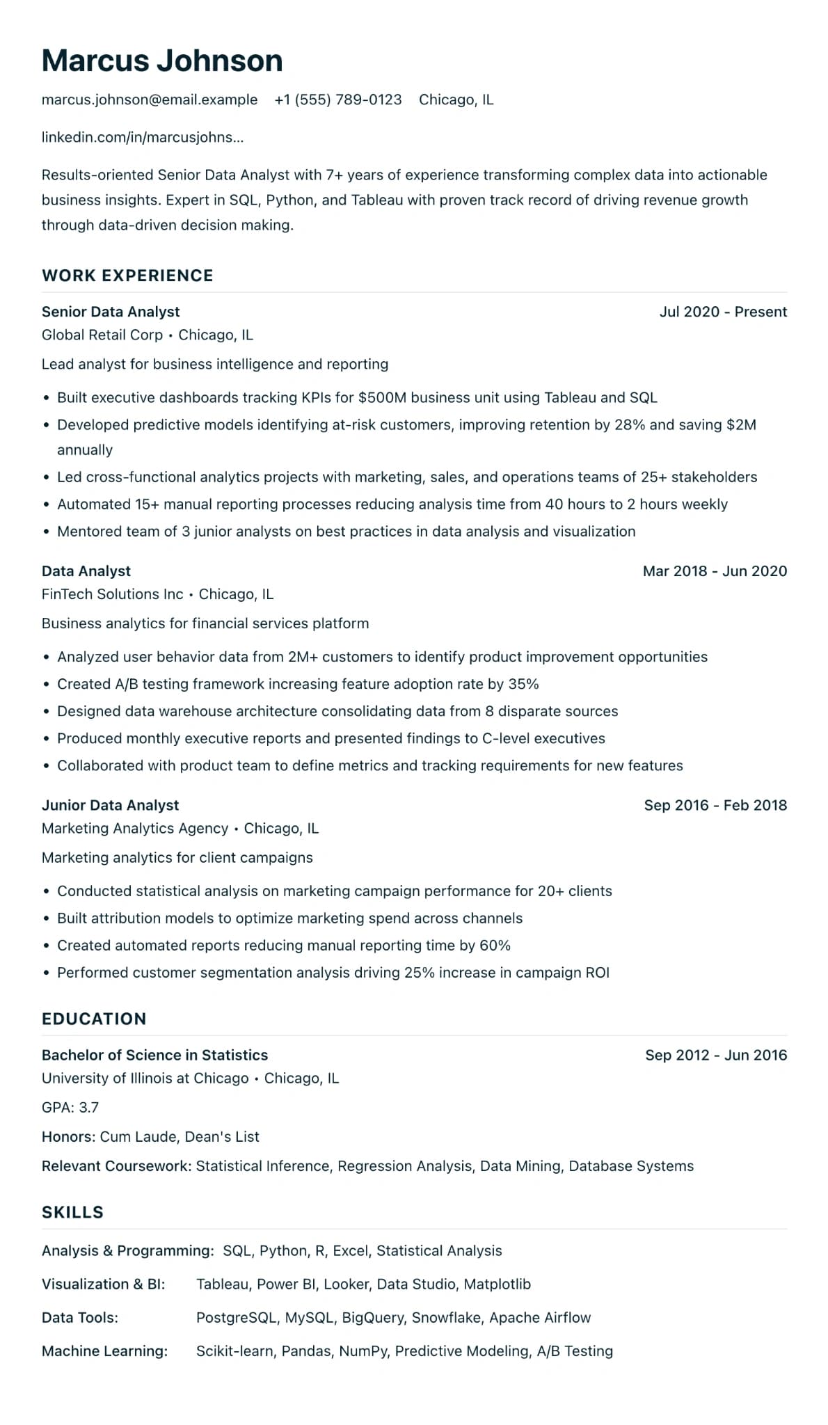
A formal one-column design in navy, for CVs full of qualifications and figures.
Best for:
- Accountants
- Finance Analysts
- Auditors
- Corporate Finance
A Pro design, also included in the 7-day trial and the 30-day Pass. The free plan includes Modern Professional, International Student, Education & Teaching. See plans
No watermark on the PDF, on any plan
Who this design is for and why
Finance & Accounting is a formal one-column design for accountants, auditors, analysts and finance managers. It shares its structure with Minimalist ATS: plain contact details with no icons, section headings in capitals, and no sidebar or photo. The difference is the tone. Headings are set in a deep navy, which reads as conservative in the way many finance employers expect.
The layout suits CVs with a lot of precise detail: a qualification such as ACA, ACCA or CIMA with the year you qualified or the papers you have passed, the systems you use, and results with figures, such as the number of entities you consolidated or the days you took off the month-end close. Put your qualification in the headline under your name so it is the first thing a recruiter sees, then list your roles with the numbers inside the bullets rather than in a separate section. Banks, audit firms and large companies often take applications through online systems, and a plain single column is read by them in the order you wrote it.
How the layout works
The page is built around precision. With no icons, rules or sidebar there is nothing on it but your text, and the generous line spacing makes figures inside bullets easy to read. Navy capital headings give it the formal tone of a set of accounts, which suits a sector where CVs tend to be conservative.
Who it suits, and who should pick another design
- Qualified and part-qualified accountants: ACA, ACCA and CIMA holders moving between practice and industry need the qualification seen first.
- Financial analysts and FP&A staff: bullets full of budgets, forecasts and variances need a clean page.
- Audit, tax and treasury roles: readers want qualifications, systems and the size of the work before anything else.
Fintech start-ups may welcome a more modern look, such as LaTeX ATS Professional (Colour). School leavers starting an accountancy apprenticeship will show their grades better in an education-first design such as International Student.
How application systems read it
Banks, audit firms and large companies often take applications through applicant tracking systems, and this single column of plain text is read in the order you wrote it. Figures stay as text, so "£2.4m" or "12 entities" can be searched and matched. Write each qualification in full once, such as "ACCA (Association of Chartered Certified Accountants)", so a search for either form finds it. On Pro, the trial or the Pass, the Word download gives recruiters an editable copy.
What to put in each section
- Headline: your qualification and role, such as "ACCA qualified management accountant".
- Profile: sector, systems and the size of the work in two or three sentences.
- Experience: three to five bullets per role, each carrying a figure.
- Qualifications and systems: qualifications with dates or exam progress, then software such as SAP or Oracle.
A worked example
Tom Hargreaves is an ACCA qualified management accountant at a manufacturing group who wants to move into FP&A. His headline states the qualification. His bullets give the numbers: month-end close cut from eight working days to five, a rolling forecast across four business units, and a cost review that found £180,000 of savings. Systems sit in a short section of their own: SAP, Power BI and Excel modelling.
Common mistakes with this layout
- Listing qualifications without dates or status. Say "qualified 2021" or "9 of 13 exams passed".
- Giving numbers without context. A saving means more next to the size of the budget.
- Burying the qualification in the education section. Readers look for it under your name.
Switching to another design
Minimalist ATS and Healthcare Professional use the same structure, so a switch only changes the heading colour. Move to a design with icons and your figures and qualifications come across unchanged; just check that long bullets still wrap neatly.
Every design downloads as a PDF that matches the editor page for page, with no watermark on any plan. This one needs Pro, the 7-day trial or the 30-day Pass, which also add Word and plain text downloads. See pricing
See this design in use
- Accountant CV example, a full example CV built on this design
- Finance CV templates and an FP&A example, where this design is one of our three picks
Start your CV in Finance & Accounting
Sign up free. No credit card required. You can switch design at any time in the editor.