
Modern Professional CV template
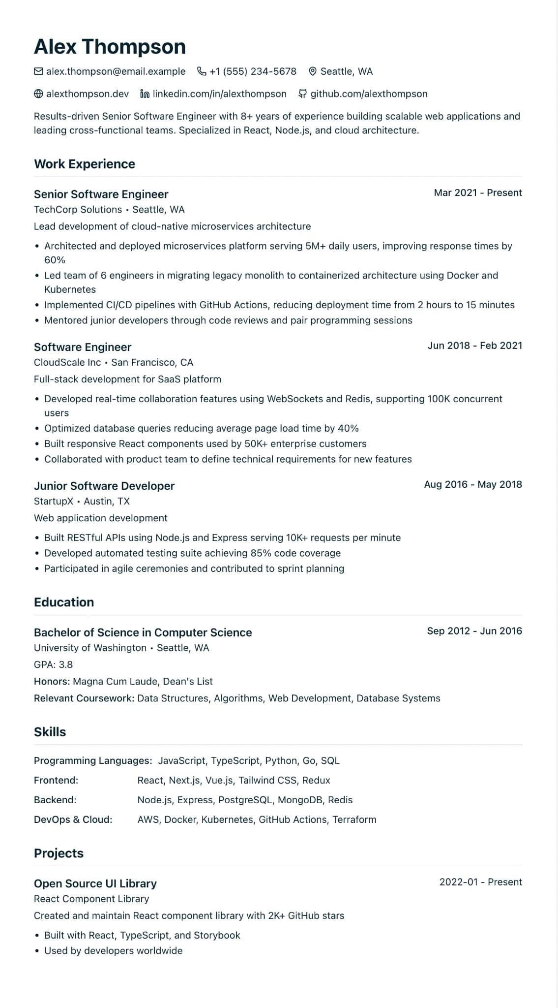
A clean one-column design with a teal accent. One of the three designs on the free plan.
Best for:
- Software Engineers
- Designers
- Product Managers
On the free plan: build this CV and download it as a PDF without paying. Free accounts get 1 CV and 1 free PDF download per CV.
No watermark on the PDF, on any plan
Who this design is for and why
Modern Professional is the design most people start with, and it is one of the three on the free plan. Everything sits in one column: your name and headline on the left, contact details on one line with small icons, then your sections in the order you choose. Section headings are teal by default, and you can pick another colour in the editor.
There is no sidebar and no photo slot, so application systems read the page top to bottom in the same order a person does. That makes it a safe choice for most jobs where the content matters more than the styling: shop and customer service roles, office jobs, tech roles and first jobs. If you are not sure which design to pick, start here and see how your content fits. You can switch design later from the editor and your content comes with you, although a free account can only switch between the three free designs. The PDF you download has no watermark on any plan.
How the layout works
The layout follows the order a UK reader expects: name, a one-line headline, contact details, a short profile, then your sections. A thin rule sits under each heading and the accent colour is used sparingly, so the page still reads well when someone prints it in black and white.
Who it suits, and who should pick another design
- Office, admin and reception jobs: these CVs are mostly short entries and practical skills, and a single column keeps them in a clear order.
- Retail, hospitality and customer service: a manager reading between shifts gets to your last job in seconds.
- Junior tech and digital roles: a GitHub or portfolio link on the contact line is easy to spot next to its icon.
With a long senior career, the roomy spacing can stretch the CV over more pages than it needs, so tighten the spacing in the design panel or trim older roles. If you want a photo, you need one of the two sidebar designs.
How application systems read it
Applicant tracking systems read this design the way you do: top to bottom, one section after another. The contact icons are small graphics, and the system reads the text beside them. Keep plain headings such as Experience and Skills, because some systems use the heading words to decide where a section starts. On Pro, the trial or the Pass, the Word download comes out as ordinary paragraphs a recruiter can edit.
What to put in each section
- Headline: one line naming the job you want, such as "Office Manager".
- Profile: three or four sentences on what you do now and what you want next.
- Experience: most recent first, three to five bullets per job, each starting with what you did.
- Skills: a few short groups rather than one long list.
A worked example
Jordan Williams has led a team of eight in a contact centre for four years and wants an office manager job. The headline says exactly that. The profile names the team size and the systems Jordan uses. The team leader role comes first, with bullets on rotas, complaint handling and training new starters, and the skills section keeps "Systems" (Microsoft 365, Zendesk) apart from "People" (coaching, rota planning). It fits on two pages.
Common mistakes with this layout
- Picking a pale accent. Light headings look fine on screen and vanish on a printout.
- Crowding the contact line. Email, phone, town and one link are plenty; a full postal address is not needed.
- Leaving the headline blank. After your name, it is the first thing a reader sees.
Switching to another design
This is one of the three free designs, so on the free plan you can move to International Student or Education & Teaching and back. Your words, dates and section order stay put; only the styling changes. Pro, the trial and the Pass open all twelve.
Every design downloads as a PDF that matches the editor page for page, with no watermark on any plan. This one is on the free plan, which includes one free PDF per CV; Word and plain text downloads come with Pro, the 7-day trial and the 30-day Pass. See pricing
See this design in use
- Apprenticeship CV example, a full example CV built on this design
- Architecture CV example for architects and Part 1 and 2 students, a full example CV built on this design
- Chef CV example (chef de partie applying for sous chef), a full example CV built on this design
- Cleaner CV example, a full example CV built on this design
- Customer service CV example, a full example CV built on this design
- Data analyst CV example and writing guide, a full example CV built on this design
- Electrician CV example and what contractors look for, a full example CV built on this design
- Part-time job CV example, a full example CV built on this design
- Receptionist CV example, a full example CV built on this design
- Software engineer CV template and example, a full example CV built on this design
- Student CV example for internships and part-time work, a full example CV built on this design
- CV example for a 16 year old with no experience, a full example CV built on this design
- Waiter CV example (senior waiter, fine dining), a full example CV built on this design
- Hospitality CV templates and a supervisor example, where this design is one of our three picks
Start your CV in Modern Professional
Sign up free. No credit card required. You can switch design at any time in the editor.