
Modern Professional (Two-Column) CV template
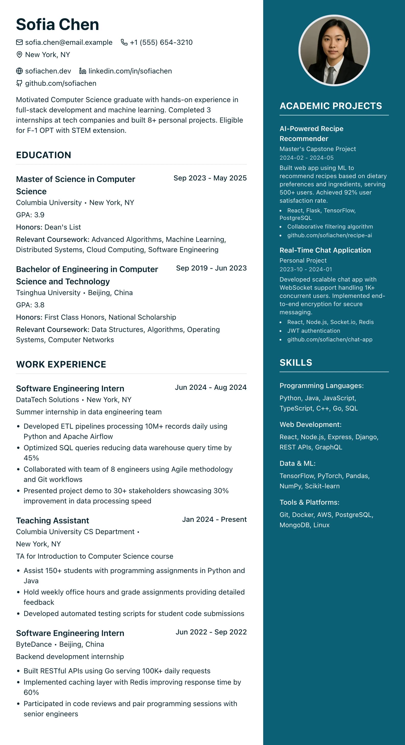
A wide main column and a coloured sidebar, with an optional photo at the top of the sidebar.
Best for:
- Creative Professionals
- Designers
- Marketers
- Product Managers
A Pro design, also included in the 7-day trial and the 30-day Pass. The free plan includes Modern Professional, International Student, Education & Teaching. See plans
No watermark on the PDF, on any plan
Who this design is for and why
Modern Professional (Two-Column) splits the page in two. Your experience and education run down a wide main column on the left, about two thirds of the width, and a deep teal sidebar takes the remaining third on the right. Skills and certifications start in the sidebar, and you can drag other short sections, such as languages, across to it. Your name and the contact icons pick up the sidebar colour.
It is one of two designs with a photo slot: an optional round photo at the top of the sidebar. UK employers do not usually expect a photo, so leave it empty for UK applications unless the role asks for one. The layout suits creative, marketing and product roles, where a recruiter will usually open the PDF and look at it. The trade-off is screening software. Some applicant tracking systems read a sidebar out of order, or after the main column, so for large employers with online forms a one-column design is the safer choice. If you need a copy for one of those forms, the Word download offers a single-column version of this CV.
How the layout works
The split puts long content where it has room and short content where it can be scanned. Experience bullets need width; a list of tools or languages does not. The sidebar is filled with your accent colour on every page, with white text, so it reads as its own panel rather than a narrow strip of type.
Who it suits, and who should pick another design
- Product managers and designers: methods and tools sit in the sidebar while the main column tells the story of what you delivered.
- Marketing and communications staff: a recruiter usually opens the PDF directly, and the coloured panel makes your CV easy to find again in a pile.
- Applications outside the UK where a photo is normal: the round photo slot at the top of the sidebar is there when an employer asks for one.
Skip it for big employers, graduate schemes and public bodies that take CVs through an online form, where the file is likely to be parsed. It also suits text-heavy CVs badly, such as an academic CV with publications, because the main column is narrower than a full page.
How application systems read it
In the PDF the sidebar is a separate column. Some applicant tracking systems read it after the main column, and some mix lines from both, so the order can come out strange even though every word is real, selectable text. The Word download (Pro, trial and Pass) offers two versions. The designed one keeps the sidebar as a shaded table cell that runs to the foot of each page. "Word, single column (ATS)" puts the main sections first and the sidebar sections after them, with no table and no photo. Use that one for upload forms.
What to put in each section
- Sidebar: skills: short groups of tools and methods, a few words each, because the column is narrow.
- Sidebar: certifications and languages: name, issuer and year on one or two lines.
- Main: profile: three sentences; it is the widest text block on the page.
- Main: experience: the bulk of the CV, with a result in each bullet.
A worked example
Sofia Rodriguez is a product designer with six years across agencies and in-house teams. Her sidebar lists "Research" (interviews, usability testing), "Tools" (Figma, Miro) and two languages. The main column opens with a three-line profile, then her two latest roles with four bullets each, such as rebuilding a sign-up flow and the change in completed sign-ups she measured afterwards. She leaves the photo slot empty because she is applying to UK studios.
Common mistakes with this layout
- Stuffing the sidebar. Only skills, certifications and custom sections can go there, and long ones turn into a tall, narrow column that is hard to read.
- Choosing a light accent. Sidebar text is white, so a pale colour makes it hard to read.
- Uploading the designed PDF to an online form when the single-column Word version would parse more cleanly.
Switching to another design
Move to a one-column design and everything in the sidebar goes to the end of the main column, with your text untouched. One-column designs have no photo slot, so a photo is not shown there. Switch back and skills and certifications return to the sidebar.
Every design downloads as a PDF that matches the editor page for page, with no watermark on any plan. This one needs Pro, the 7-day trial or the 30-day Pass, which also add Word and plain text downloads. See pricing
See this design in use
- Graphic designer CV example (mid-weight to senior), a full example CV built on this design
- Creative CV templates and a designer example, where this design is one of our three picks
Start your CV in Modern Professional (Two-Column)
Sign up free. No credit card required. You can switch design at any time in the editor.