
Sales & Marketing CV template
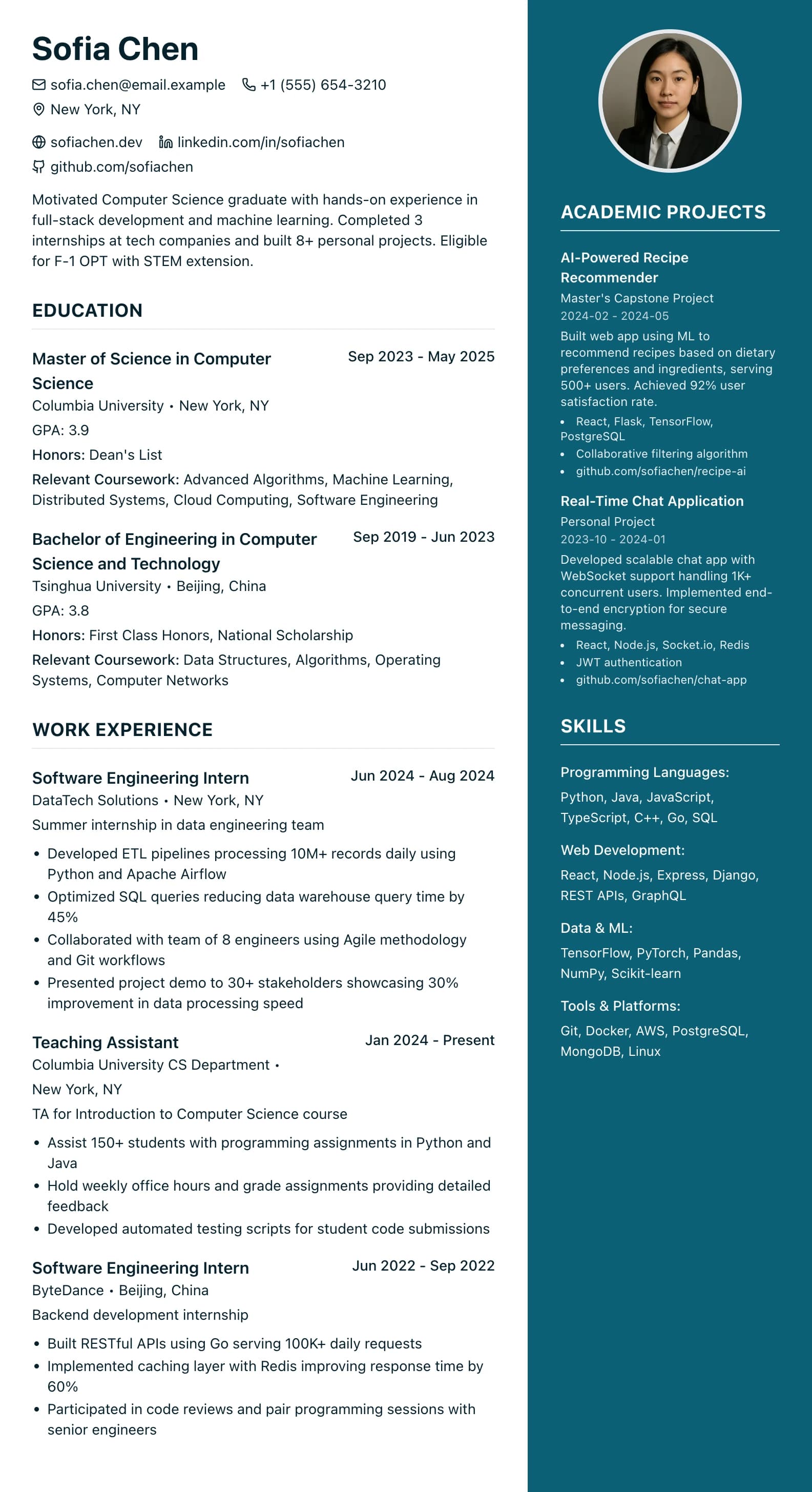
A two-column design in bright teal, with a main column for results and a sidebar for tools.
Best for:
- Sales Reps
- Marketing Managers
- Business Development
- Account Executives
A Pro design, also included in the 7-day trial and the 30-day Pass. The free plan includes Modern Professional, International Student, Education & Teaching. See plans
No watermark on the PDF, on any plan
Who this design is for and why
Sales & Marketing is a two-column design for sales reps, account executives, business development and marketing staff, where results are the point of the CV. It uses the same layout as Modern Professional (Two-Column): a wide main column on the left for experience and a coloured sidebar on the right, here in a brighter teal. Skills and certifications start in the sidebar, your name picks up the accent colour, and there is an optional round photo slot at the top of the sidebar. Leave it empty for UK applications unless you are asked for one.
The main column gives each role room for bullets that lead with numbers, such as revenue against target, pipeline built or campaign results. The sidebar holds your tools, such as Salesforce or HubSpot, along with languages and qualifications. The layout is designed for a person opening the PDF, for example a hiring manager after a referral or a recruiter at an agency. If you apply through a large employer's online form, some screening software reads a sidebar out of order, so keep a one-column copy or use the single-column Word download.
How the layout works
A sales CV holds two kinds of content: results, which need sentences, and tools and territories, which do not. That is why this design splits the page. The bright teal sidebar runs the full height of each page with white text, and the main column stays plain so the numbers in your bullets stand out against white space.
Who it suits, and who should pick another design
- Account executives and business development managers: revenue against target and pipeline built belong in the wide column.
- Digital marketers and campaign managers: channels and platforms fit the sidebar, and campaign results sit beside each role.
- Recruitment consultants: placements and billings are what a hiring manager scans for.
For a corporate careers site that parses CVs, or a graduate sales scheme with an online form, a one-column design is safer. It is also a poor fit if you have few figures yet, because the layout draws the eye to the results column.
How application systems read it
Because the sidebar is its own column in the PDF, some applicant tracking systems read it after the main column or interleave the two. Your words are real text either way, but the order can suffer. For upload forms, choose "Word, single column (ATS)": main sections first, sidebar sections after them, one column, no table and no photo. The designed Word version keeps the shaded sidebar as a table that runs to the foot of each page. Both Word downloads come with Pro, the trial or the Pass.
What to put in each section
- Sidebar: skills: CRM and marketing tools, such as Salesforce, HubSpot or Google Ads, in short groups.
- Sidebar: certifications: short entries such as a sales methodology course, with the year.
- Main: profile: the kind of selling you do, the sector and your best result.
- Main: experience: each role with its target and what you achieved against it, as numbers.
A worked example
Daniel Reyes is an account executive selling software to mid-sized firms. His sidebar holds Salesforce, HubSpot and LinkedIn Sales Navigator, plus Spanish under languages. The main column opens with a profile naming new business in software as a service, then two roles with bullets such as "118% of annual quota in 2024" and "built a £1.2m pipeline in a new region". For one bank's careers site he uses the single-column Word download.
Common mistakes with this layout
- Giving results without a baseline. A deal total means more next to the target.
- Changing the accent to a pale colour. The sidebar text is white and needs a dark enough background.
- Turning the sidebar into a second CV. Long custom sections there become a narrow strip of text; keep it to short lists.
Switching to another design
Switch to Modern Professional (Two-Column) and the sidebar stays exactly as it is, in a deeper colour. Switch to a one-column design and your sidebar sections move to the end of the main column, with nothing lost; the photo is not shown there because one-column designs have no photo slot.
Every design downloads as a PDF that matches the editor page for page, with no watermark on any plan. This one needs Pro, the 7-day trial or the 30-day Pass, which also add Word and plain text downloads. See pricing
See this design in use
- Marketing CV templates and a digital marketing example, where this design is one of our three picks
Start your CV in Sales & Marketing
Sign up free. No credit card required. You can switch design at any time in the editor.