
LaTeX ATS Professional CV template
The look of a CV typeset in LaTeX, in black and grey, without writing any code.
Best for:
- Software Engineers
- Technical Roles
- FAANG Applications
- ATS Systems
A Pro design, also included in the 7-day trial and the 30-day Pass. The free plan includes Modern Professional, International Student, Education & Teaching. See plans
No watermark on the PDF, on any plan
Who this design is for and why
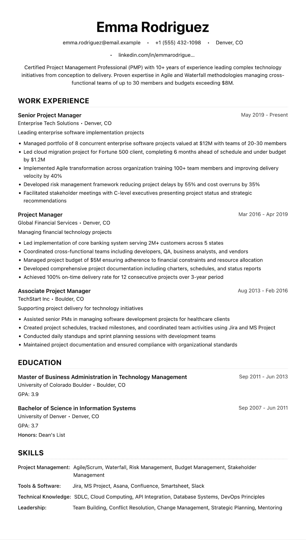
LaTeX ATS Professional recreates the look of a CV typeset in LaTeX, the style many engineers and researchers know from Overleaf, without you having to write any code. Sizes are set in points, as they would be in LaTeX: a 28pt name centred at the top, 14pt section headings in capitals and 10pt body text with tight spacing. The name and text are black and the headings slate grey, with no icons, sidebar or photo.
The result fits a lot on one page and prints cleanly in black and white, which suits technical, research and project roles where a reader wants to scan dates, tools and results quickly. Because it is one column of real text, screening software reads it in order. The dense setting is also its limit. If you have little experience yet, the page can look empty, and International Student or Modern Professional will fill it better. If you like the layout but want a little colour for a CV that will mostly be read on screen, the teal version of this design keeps everything else the same.
How the layout works
The design copies the conventions of the LaTeX CVs many engineers and researchers write in Overleaf. Sizes are set in points, as LaTeX sets them, with half-inch margins, a centred name and ruled capital headings. There is no colour at all, so the page prints cleanly on any office printer and looks the same on screen as on paper.
Who it suits, and who should pick another design
- Software engineers applying to tech companies: reviewers know this look and scan it for languages, systems and scale.
- Researchers and PhD graduates moving into industry: projects, papers and skills need to fit on one or two pages.
- Quantitative and data roles: readers want tools and results, packed close together.
Early-career applicants with one job and a degree will find the page looks empty. For roles where warmth counts more than density, such as care work or front-of-house jobs, a roomier design sends a better signal.
How application systems read it
A CV typeset in LaTeX itself can produce a PDF whose text copies out oddly, with joined letters or missing spaces. That does not happen here: the look is LaTeX, but the file comes from the same renderer as every other design, so the text is ordinary selectable text in one column. There are no icons, so the contact line is plain text too. If a recruiter asks for a .docx, the Word download on Pro, the trial or the Pass gives editable paragraphs.
What to put in each section
- Header: your name, then one centred line of contact details and links.
- Experience: role, employer, place and dates, then three to five short bullets naming the tools and the scale.
- Projects: a custom section for open-source or research work, one or two lines each.
- Skills: grouped by type: languages, frameworks, infrastructure, tools.
A worked example
Ryan O'Connor is a backend engineer with five years' experience. His one-page CV has two roles, each with four bullets naming the language, the system and a measure such as request volume. A "Projects" section lists an open-source library he maintains, and his skills sit in four short groups. It all fits on one A4 page.
Common mistakes with this layout
- Writing paragraphs. Small type is hard going in long blocks; keep bullets to one or two lines.
- Squeezing the margins further to save a page. If it does not fit at the default settings, cut older roles.
- Sending it where it will mostly be read on a phone. Ten-point text is small on a small screen.
Switching to another design
The Colour version is the same design with teal headings, and Minimalist ATS is a roomier plain option. Your content moves across unchanged, but because type sizes differ, look at where the pages break after you switch.
Every design downloads as a PDF that matches the editor page for page, with no watermark on any plan. This one needs Pro, the 7-day trial or the 30-day Pass, which also add Word and plain text downloads. See pricing
See this design in use
- Consulting CV example for management consultants, a full example CV built on this design
- Mechanical engineer CV example for UK design roles, a full example CV built on this design
- Project manager CV example, a full example CV built on this design
- Computer science CV templates for students and graduates, where this design is one of our three picks
Read the guide
How to write the CV this design is built for: ATS CV Builder: Beat the ATS in 2026.
Start your CV in LaTeX ATS Professional
Sign up free. No credit card required. You can switch design at any time in the editor.