
Minimalist ATS CV template
The plainest of our designs, built to be read by screening software and people alike.
Best for:
- Corporate Roles
- Traditional Industries
- ATS Systems
A Pro design, also included in the 7-day trial and the 30-day Pass. The free plan includes Modern Professional, International Student, Education & Teaching. See plans
No watermark on the PDF, on any plan
Who this design is for and why
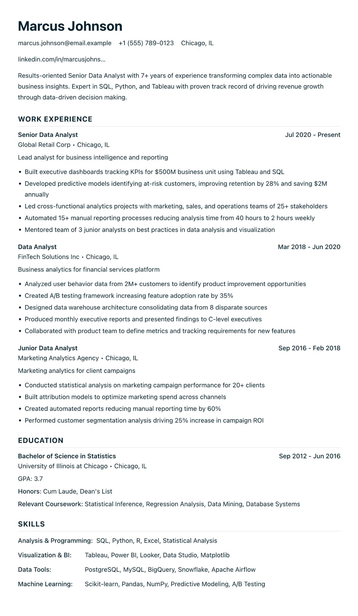
Minimalist ATS strips a CV back to what screening software and a busy reader both need. It is one column with no icons, no sidebar and no photo. Contact details are plain text, section headings are in navy capitals, and the body text has generous line spacing so a long page of bullets stays readable.
Use it when you apply through an online form at a large employer, a law firm, a public body or a recruitment agency, where your CV is likely to be parsed before anyone reads it. Plain headings such as Experience, Education and Skills help the software put your details in the right fields. It is also a good fallback if a more styled design came out jumbled in an upload form, or if the text looks wrong when you copy it from the PDF and paste it into a plain text editor. The plain look is deliberate, and the structure does the work. Two other designs, Finance & Accounting and Healthcare Professional, use this same structure with a different accent colour, so pick whichever colour suits the jobs you apply for.
How the layout works
Everything here is something a parser or a tired reader would thank you for. Contact details are plain text with no icons, sections are separated by space rather than lines, and the body text has more line spacing than most of our designs, which keeps a page of bullets readable on screen.
Who it suits, and who should pick another design
- Online applications at large employers: your CV is often parsed into form fields before a person opens it.
- Legal, compliance and operations roles: a plain page matches what these sectors expect to see.
- Recruitment agency registrations: agencies load your CV into their own database before a consultant reads it.
If a person will judge you partly on how the CV looks, as in design or marketing, the plain page undersells you. If you want some colour, Finance & Accounting and Healthcare Professional are the same layout with a different accent.
How application systems read it
This is our simplest structure for applicant tracking systems: one column of real text, no icons, no tables, and capital headings that use ordinary words. A quick test works for any design: open the PDF, select all, and paste into a plain text editor. If the text comes out in the right order, that is a good sign. On Pro, the trial or the Pass you can also download a TXT file, which is the same words with no design at all.
What to put in each section
- Headings: keep the familiar ones: Profile, Experience, Education, Skills.
- Experience: job title, employer, town and dates, then bullets.
- Skills: the exact terms from the advert that you can honestly claim, such as "stakeholder management" or "SQL".
- Certifications: full names rather than initials, such as "PRINCE2 Foundation".
A worked example
Emma Johnson is an operations analyst applying to three banks through their careers sites. Her CV has a two-line profile, two roles with five bullets each, a skills section that repeats the advert wording where it is true ("process mapping", "Power BI", "SQL") and certifications written in full. Before each upload she pastes the PDF text into a plain text editor to check the order.
Common mistakes with this layout
- Renaming headings to stand out, such as "Where I have made a difference". Parsers look for familiar words.
- Abbreviating everything. "Mgr" and "Ops" save space but are less likely to match the words in an advert.
- Shrinking the type to save a page. Cut older roles instead; the spacing is what keeps this design readable.
Switching to another design
Finance & Accounting and Healthcare Professional share this exact structure, so switching between the three changes only the accent colour. Moving to a design with icons or a sidebar keeps every word, but check the PDF afterwards, because spacing and page breaks change.
Every design downloads as a PDF that matches the editor page for page, with no watermark on any plan. This one needs Pro, the 7-day trial or the 30-day Pass, which also add Word and plain text downloads. See pricing
See this design in use
- Administrator CV example, a full example CV built on this design
- Security officer CV example, a full example CV built on this design
- Warehouse operative CV example, a full example CV built on this design
- Construction CV templates for site, trade and management roles, where this design is one of our three picks
Read the guide
How to write the CV this design is built for: ATS CV Builder: Beat the ATS in 2026.
Start your CV in Minimalist ATS
Sign up free. No credit card required. You can switch design at any time in the editor.